Our Kitchen Collection 2024
Farrow & Ball Key Colour Trends
25th July 2015The colours we will want to use in our kitchens this year reflect a desire to create spaces offering escapism from our increasingly nomadic working lives, where smart devices keep us connected wherever we are. Key colours from Farrow & Ball are Pink Ground, Light Blue, Breakfast Room Green and Tanner’s Brown which promote relaxation and reflection in our interiors. Paler in their appearance they help to create spaces that live and breathe as we look to our home as places of sanctuary from the stresses of modern day living.
Breakfast Room Green®
Breakfast Room Green feels lively at any time of day. Taken straight from nature it makes us feel safe and calm in our home environment. Its slightly botanical feel creates a fresh room when paired with complementary James White on the ceiling. The Hollinwood Cream kitchen range is a simplistic shaker style kitchen constructed from solid oak and painted in one of 12 bespoke colours. A kitchen range that can portray both a traditional and contemporary look. The Hollinwood Painted kitchen ranges are a timeless classic and are a great addition to both small and large kitchen areas. The addition of Breakfast Room Green to a Hollinwood Cream kitchen would enhance the beauty in your kitchen. Create a contrastif feature wall in your kitchen with stronger Calke Green Complete the look with accent colour accessories. This trend reflects a shift away from hard, graphic interiors to a softer more natural feel with a modern twist.
The use of Light Blue in the home is intended to create an interior where colours shift and change like the landscape. We instinctively gravitate towards colours that
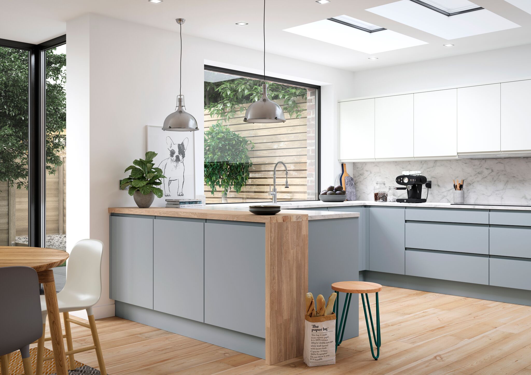
remind us of the softer side of life to make our homes into an oasis of calm away from the brashness of modern life. Enhance the simplistic Deedale White kitchen with Farrow & Ball Light Blue wall paint. The silvery, smoky qualities of the Light Blue work alongside the neutral, modern and luxurious high quality gloss Deedale White. Create a feature colour with Dimpse, a colour inspired by the tones of Twilight. A complimenting grey shade could also be placed on the floor.
Pink Ground creates a humble beauty in the home, making rooms feel pretty, soft edged and accessible. Although certainly warm, this pink is not sugary or infantile, rather it feels more like a diluted plaster colour where walls look almost nude. Use with a sophisticated handleless kitchen finished in an luxurious grey gloss. Accent colours should stay cloudy and soft. Pale Powder sits perfectly alongside Pink Ground; use it on stools of window dressing for a more relaxed feel, or on the floor to complement this fabulous room.
Although we are craving lighter, paler tones in 2015, darker tones remain best where natural light is lacking. Create darker, dramatic spaces with Tanner’s Brown and at the same time make other areas feel lighter in comparison. The warm tones created by Hollinwood Oak compliment the Tanner’s Brown fantastically. This earth brown feels totally timeless and has an artisan feel to it. A tip is to use it on skirting boards to keep it grounded and to prevent a light line around the bottom of the room. Looking to create a feature wall with a splash of colour , the Muted Oval Room Blue has a luxurious finished result.
View Farrow & Ball website to view a full range of colours available.
Interior Design Service
We are on hand to help you choose wall colours, fabrics, flooring and much more.
Are you thinking of having an extension? Bring in your architect's plans and we can begin to design your dream kitchen. We can undertake as much of the project as you like from supplying and installing to fully project managing your kitchen. Get in touch today to start your kitchen adventure with Deelux.
Design Service

